
Motifs & illustration
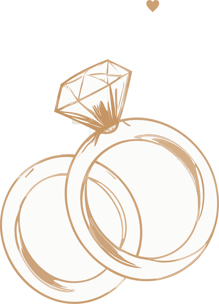
A small set of warm, hand-drawn marks – hearts, sparkles, rings, sprigs – used as quiet punctuation, never as wallpaper. All of them live in the sand-and-tobacco range so they sit softly on cream and white.
Everything on this page ships in the app (assets/design/) and is rendered by the current build – nothing decorative gets invented for new surfaces without landing there first.
The motif set
The core marks, as drawn for the wedding-day hero card.




Flourishes
Single accents placed beside headings and wells – one per surface.




Dividers & patterns



Top to bottom: the wedding-day card divider, the all-categories divider, and the category-card divider. The dashboard’s section headers carry a soft peach pattern (section-header-pattern.svg) behind their titles. Use dividers whole – never stretched or recoloured.
Hero illustrations on navy
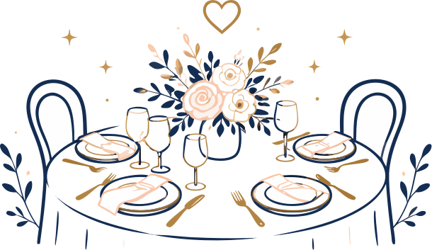
Navy hero cards get line-drawn illustrations in white and gold – the only artwork that sits on navy.

Illustrations on light
Fuller scenes for empty states and feature moments, in the same warm palette.



The mascot

The PlanJolly mascot greets couples on the app’s welcome screen and on planjolly.com.
The one hard rule: only real renders of the mascot are ever used. It is never AI-regenerated, redrawn or restyled – and the same applies to app UI in marketing: real screenshots only.
Using motifs well
Punctuation, not pattern
One motif per moment. A sparkle beside a headline, a divider at a close – never scattered across a layout.
Keep the palette
Motifs ship in their own sand tones. Don’t recolour them to navy or the semantic colours – the one exception is hero-book, drawn in currentColor for the navy hero.
Room to breathe
Motifs earn their warmth from the space around them. If a layout feels tight, remove the motif rather than shrinking it.